Branding
For many years, I’ve been helping organizations and individuals transform ideas, philosophies, and personalities into visual identities. Reducing something complex to a shape, colour palette, or typeface can be a daunting task, but it’s also one of the most rewarding parts of design.
The projects below represent a collection of brands, visual languages, and identity systems I’ve developed over the course of my career.
OCAS
Challenge
OCAS had evolved from a transactional application service into a broader organization supporting Ontario’s public college system. The existing identity needed to communicate collaboration, innovation, and future-focused thinking while remaining professional and recognizable across digital, print, environmental, and corporate applications.
Approach
I developed a visual identity built around six interconnected tiles forming a hexagon, representing both individual contributions and collective strength. The mark incorporated symbolic elements tied to collaboration, possibility, and innovation, while maintaining the flexibility required for corporate communications, digital products, marketing materials, and physical environments.
The system was designed to scale beyond a logo, becoming a recognizable visual asset that could support the organization across a wide range of touchpoints.
Outcome
The identity became the public face of OCAS for more than a decade, appearing across corporate communications, facilities, marketing initiatives, digital products, and partner-facing materials. The brand evolved alongside the organization and remained a recognizable symbol of OCAS as it expanded its role within Ontario’s post-secondary ecosystem.
The OCAS logo is based on six tiles, representing our distinct yet united team nature. The tiles join to make a hexagon, a shape associated with beehives, making it naturally representative of themes like cooperation and hard work. In numerology, the number six has also been known to represent communication, truth, balance, sincerity, reliability, and harmony – many of the characteristics that we exemplify in our corporate culture.
The single blue tile in the shape, unique from the others, represents possibility – looking ahead to the future and creating opportunities to think and act in new ways. The blue tile calls attention to itself, a natural byproduct of being different, but its difference is not intimidating or threatening.
The final component of the logo, and arguably the most important, is the spark within the tiles. This spark represents our curiosity, creativity, and passion. We show up to work every day because we care about what we do, and it’s these characteristics – this spark – that will drive and support us as we work to uncover what tomorrow looks like.

I had also designed the previous version of the logo. This brand worked in SACO, which was the fresh equivalent of OCAS. Eventually, the brand would mature to stand as just OCAS and even the ‘Ontario College Application Service’ was dropped.
This was a 2013 Christmas Postcard we sent out to Partners.

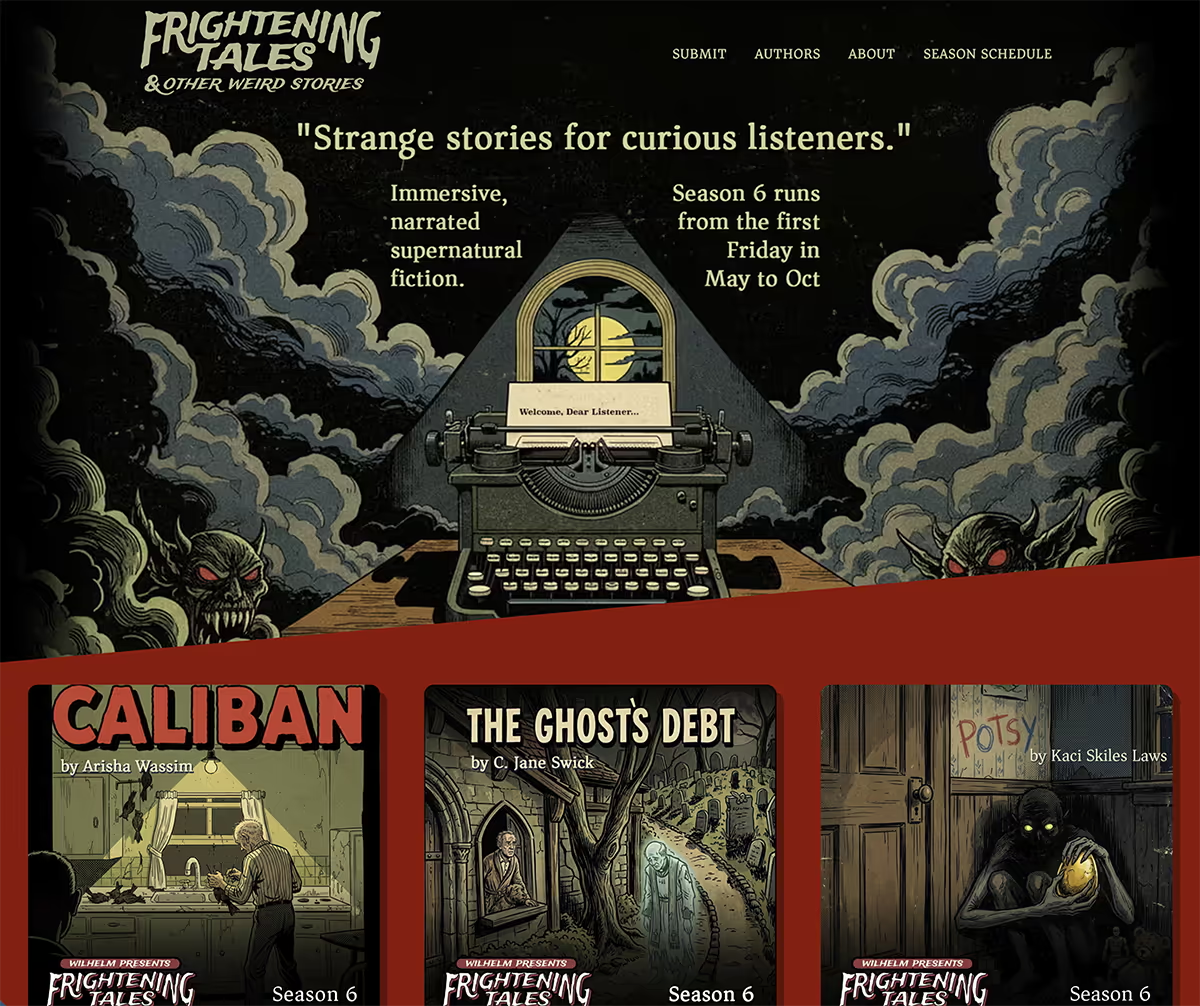
Wilhelm Presents: Frightening Tales & Other Weird Stories
In 2020, I created Wilhelm Presents: Frightening Tales, a horror fiction podcast featuring stories from authors around the world.
As the show evolved, so did its identity. What began as a podcast focused exclusively on horror expanded to include strange fiction, dark fantasy, and other forms of the weird. The original logo reflected the show’s horror roots, while the updated identity broadened the brand to support a wider range of supernatural and speculative storytelling.
The redesign preserved the recognizable hand-crafted character of the original mark while creating space for the podcast’s growing scope and audience.

The Department of Curious Findings
In 2026 Author M. G. Wilhelm wrote more than 700 pages of what would become a 400+ page novel called ‘The Department of Curious Findings‘. The novel is still in the copyediting stages when this is being written but the cover and brand was created for the final book. The goal was to make the mark look antique and aged. Imperfections were intentionally added to create this appearance.


Branding
For many years, I’ve been helping organizations and individuals transform ideas, philosophies, and personalities into visual identities. Reducing something complex to a shape, colour palette, or typeface can be a daunting task, but it’s also one of the most rewarding parts of design.
The projects below represent a collection of brands, visual languages, and identity systems I’ve developed over the course of my career.
Selected Work

Evolution
To prevent visual fatigue and keep campaigns engaging, the system was periodically refreshed. New layouts, image treatments, and content structures were introduced while preserving the core visual language, allowing the brand to evolve without sacrificing recognition.

Ontario Colleges Website
Challenge
Ontario Colleges embarked on a year-long initiative to establish a more formal and cohesive brand identity. The challenge was not only defining the brand, but applying it consistently across a complex ecosystem of websites, communications, marketing materials, and learner-facing experiences.
At the same time, the primary website required modernization. Years of content growth had created complexity, making it difficult for users to find information and challenging for teams to maintain consistency. The goal was to create a trusted, recognizable experience while improving usability, scalability, and content governance.
Approach
The project began with a comprehensive audit of the existing website and content ecosystem. Using analytics, stakeholder input, and content reviews, we identified opportunities to simplify navigation, consolidate content, and better support key learner journeys.
As the new brand was being developed, we translated its principles into a scalable digital experience. A streamlined information architecture was created, and site content was consolidated into a small set of flexible page templates capable of supporting the majority of user needs.
This approach allowed the new Ontario Colleges brand to be applied consistently across the platform while creating a sustainable framework for future content growth, marketing initiatives, and learner experiences.


Outcomes
The content is to follow.