

Creative
by M. G. Wilhelm
Senior Graphic Designer
Art Director
Illustrator
Evidence
Welcome!
I'm M. G. Wilhelm
I’m a multidisciplinary designer with 25 years of experience solving visual and communication problems.
I turn complexity into clarity through brand, digital, UX/UI, illustration, and product design. I design with accessibility and inclusion in mind, creating experiences that are clear, intuitive, and meaningful to the people using them.

Passion.
I love solving complicated problems. ❤️
Whether it's a visual system, a website, a product, or an idea that nobody quite knows how to explain yet, I like figuring out what matters, what doesn't, and how to make the whole thing easier to understand.
That's where design gets interesting for me. Taking something complicated and finding the clearest way through it.
Tools I'm
fluent in.
Brand & Visual Design
Brand Identity
Visual Design
Typography
Illustration
Motion Graphics
Print Design
Art Direction
UX/Product Design
UX/UI Design
Information Architecture
Design Systems
Interaction Design
Responsive & Accessible Design
WCAG/AODA Compliance
Research & Strategy
Research & Strategy
Discovery Workshops
Requirements Gathering
User Journey Mapping
Stakeholder Collaboration
MVP Scoping
Agile / Iterative Design
Workflow Design
Tools & Technology
Figma / Miro
Adobe Creative Cloud
HTML / CSS / Tailwind
WordPress
Azure DevOps
Monday.com
Microsoft 365
Canva Affinity
Teams I've
helped.
TD Bank
Ontario College Application Service Ontario Learn
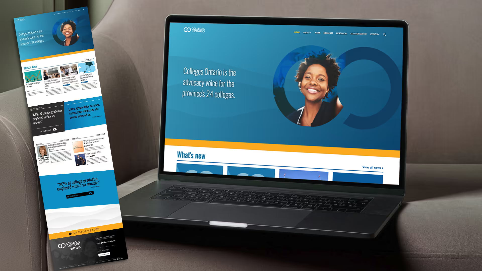
Colleges Ontario
St. Lawrence
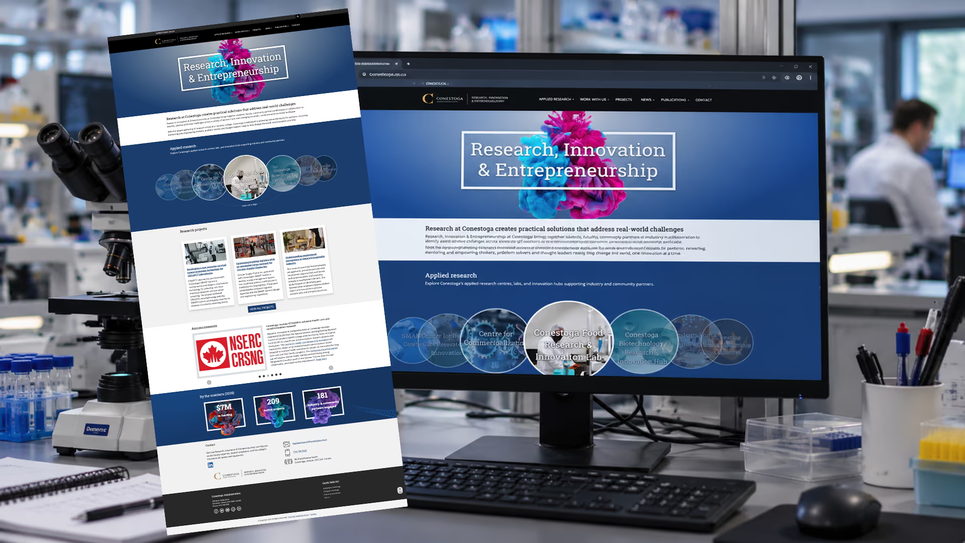
College Conestoga College
Ontario Colleges
College Trades
College Employer Council
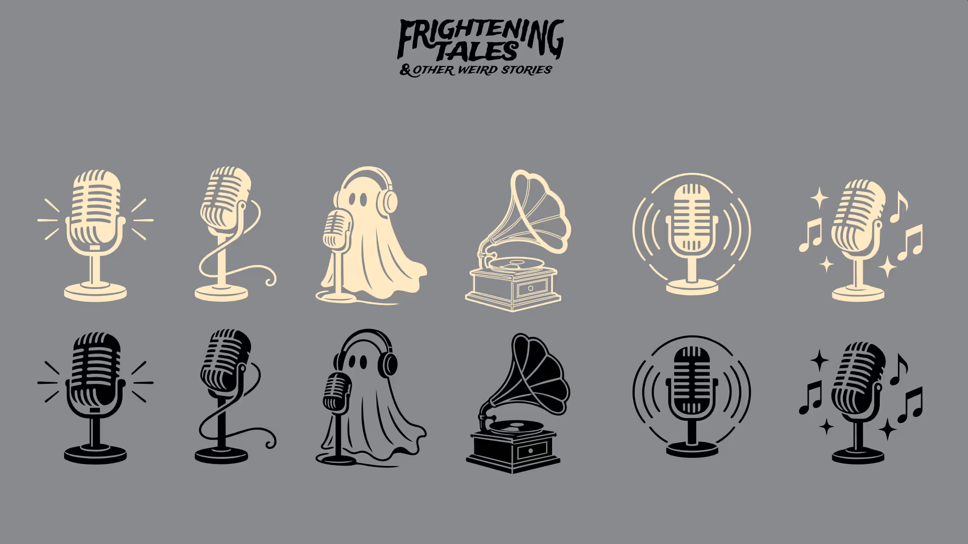
Frightening Tales & Other Weird Stories
Toronto Grizzlies Football
Education.
I hold a Bachelor's degree equivalent in Education, supported by more than 25 years of professional design experience. My formal creative training includes two years of Illustration at Sheridan College and two years of classical Animation and Storytelling training, providing a foundation in drawing, visual communication, character, composition, movement, and narrative.
In 1998, I transitioned into Graphic Design and Front-End Development, expanding my skills into digital design and learning HTML and CSS. This combination of formal education, traditional art training, and more than two decades of professional practice has shaped my approach as a multidisciplinary designer, bringing together visual design, illustration, storytelling, interaction, and digital production.
In 2020, I expanded my professional skill set to include digital accessibility and accessibility-focused design. I developed a working knowledge of WCAG (Web Content Accessibility Guidelines) and AODA (Accessibility for Ontarians with Disabilities Act), applying accessibility principles to digital experiences, visual design, and user interfaces.
Exhibits.
A. Branding
B. Print
C. Ux/Ui
D. Storytelling
E. Illustration
Exhibits.
A. Branding
B. Print
C. Ux/Ui
D. Storytelling
E. Illustration
Branding.
Frighteningtales.com
In early 2026, I redesigned a formal branding package to carry Frightening Tales into the foreseeable future. Up to this point nothing had been formalized for the brand.
Retro horror comics were the primary inspiration for the brand. Because the identity would need to coexist with an assortment of comic imagery and a variety of typographic treatments, the rest of the system needed to be deliberately restrained.
The solution was to establish a single typeface as a foundational and recognizable element of the brand. The colour palette was equally simple: three colours inspired by the classic hues of early graphic design. Black, white and red, but with the dial turned toward the period: charcoal instead of pure black, crimson instead of bright red, and an aged, yellowed white.
The result gives the imagery room to do the storytelling while the underlying system provides consistency and recognition.


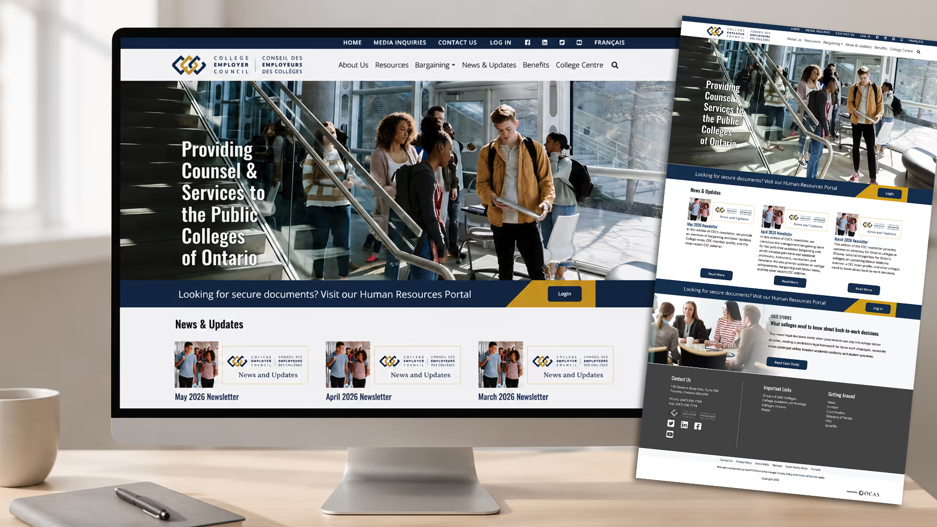
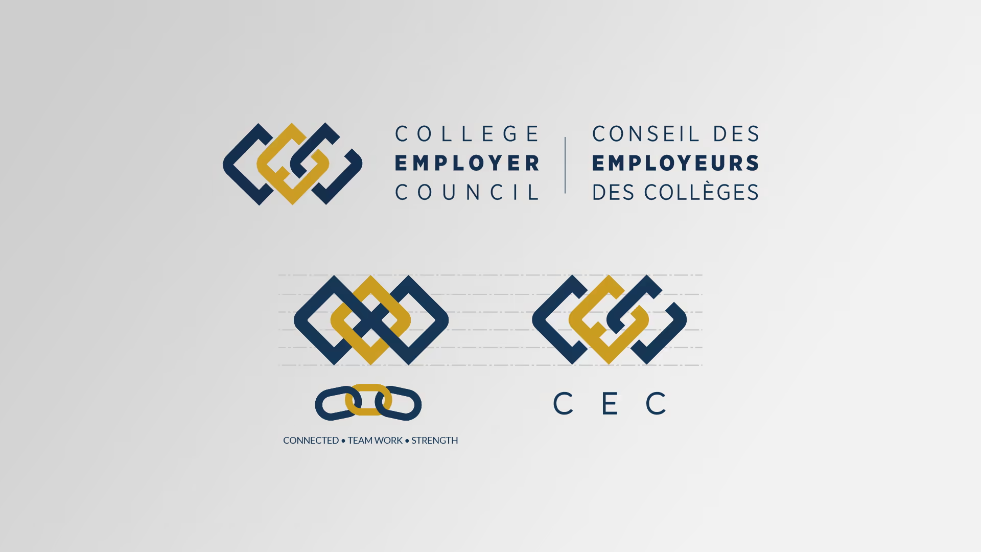
College Employer Council Logo
While working at OCAS, we were approached by a partner who needed a proper logo mark to represent them going forward. They already had an established brand voice and colour palette. What they needed was a visual identity that could become recognizable in its own right.
After a discovery session with the team, several key ideas emerged: connected, interlocked, teamwork, and strength. They were also adamant that they wanted the letters of their name incorporated into the design.
The resulting mark brings those ideas together, using interlocking forms to create a sense of connection and strength while working the initials CEC directly into the symbol.

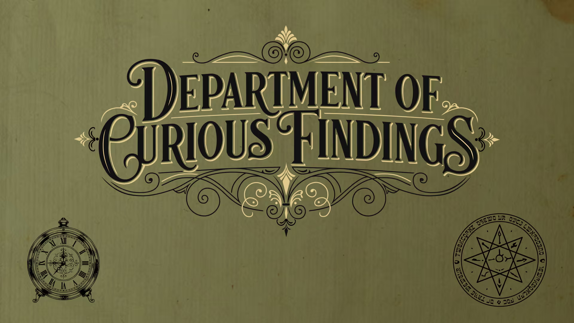
Department of Curious Findings
Created for a novel of the same name, the author wanted an embellished mark with classical flourishes and an old-world sensibility.
Rather than adapting an existing typeface, I illustrated the entire mark from scratch, drawing the lettering and ornamental details as a single composition. Its completely custom nature gives the identity a distinctive character that couldn't simply be reproduced by selecting a font.
Print.
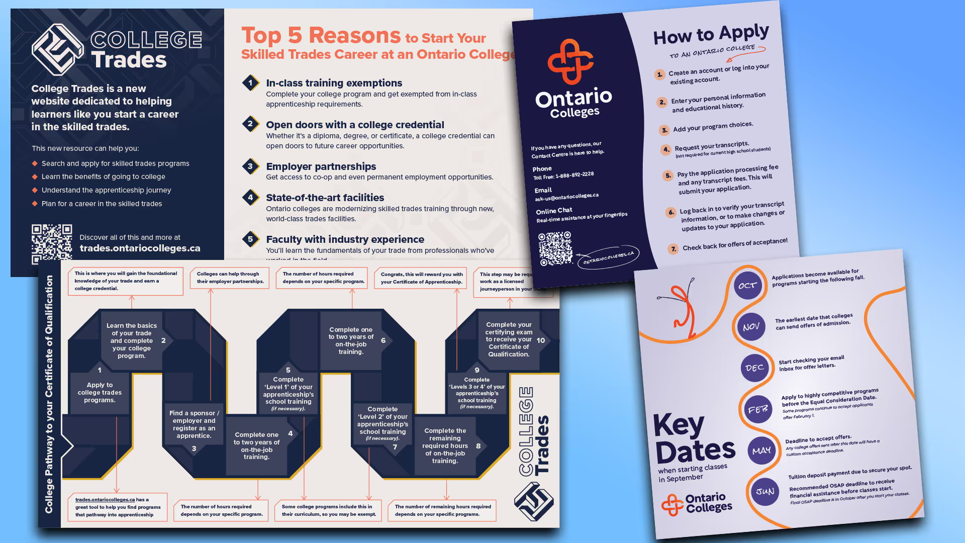
Ontario Colleges Event Materials
in 2026 I created cards as handouts at Events our promotional team was attending. The Material had to be attractive, on brand and informative. We decided to share the pathway to college and the type of programs available in the College system as well as How to actually apply and the key dates students would need to be aware of.

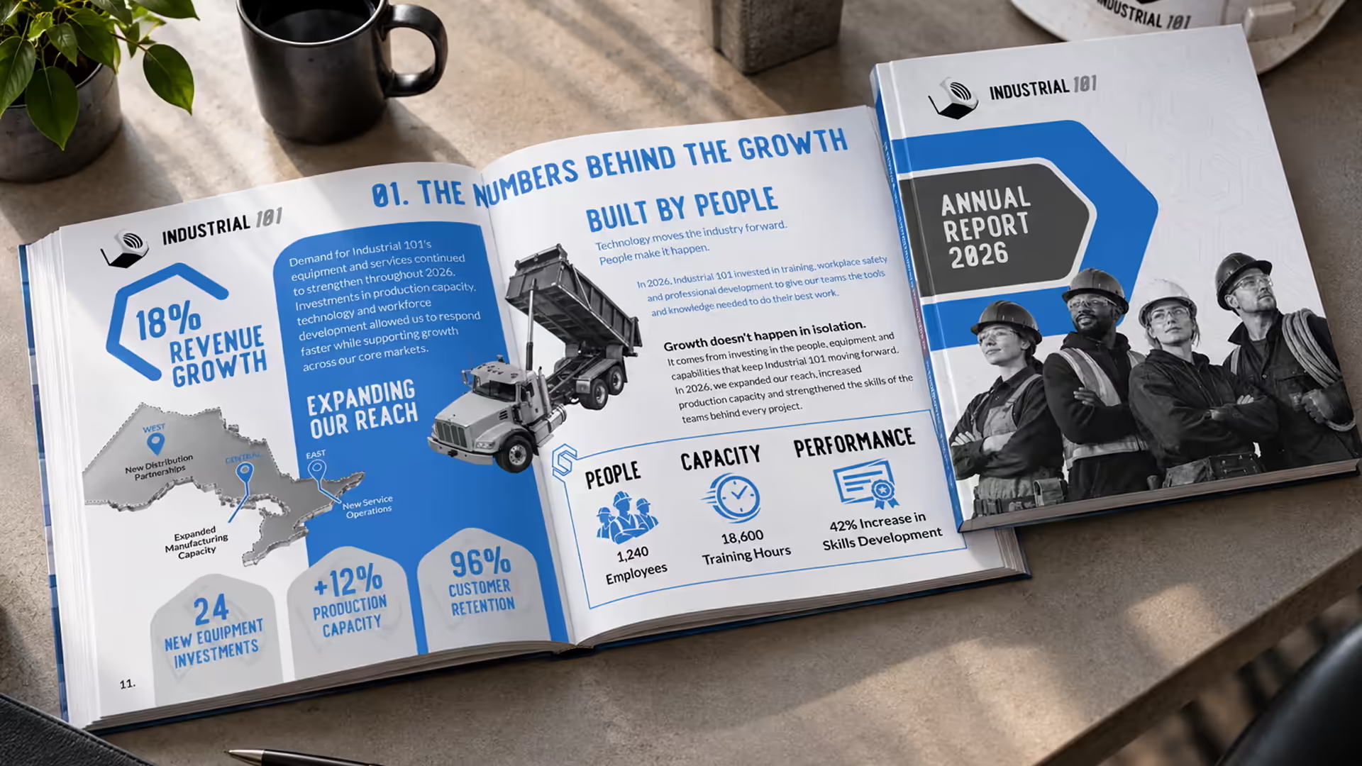
OCAS Annual Applicant Survey Report
Each year at the completion of the application cycle applicants to colleges in Ontario receive and invite to fill out an applicant survey. Those result are gathered and assembled into a report provided to the 24 public colleges in Ontario. I was the lead designer on these reports.


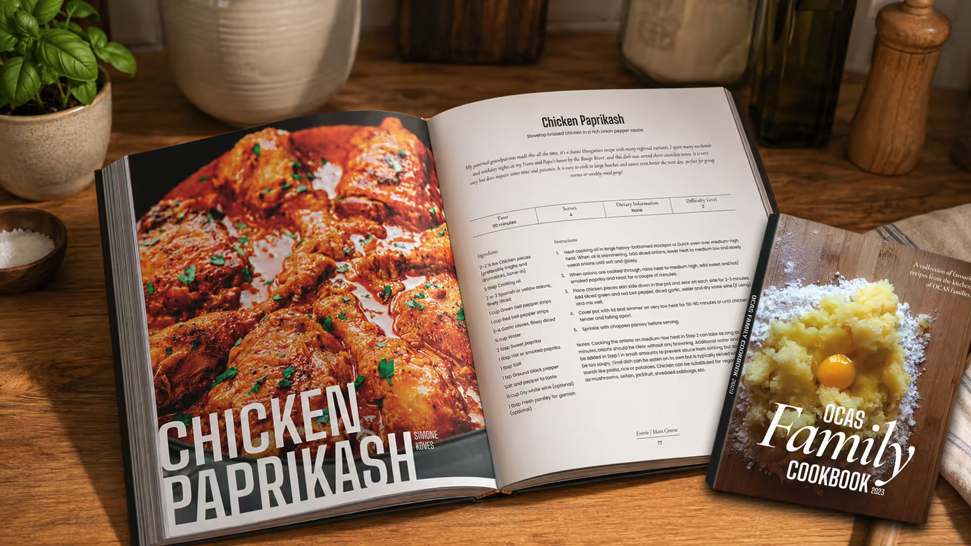
OCAS Family Cookbook


Ui/Ux.
ontariocolleges.ca
My Role: Working alongside a Product Designer, I translated the new brand into the digital experience, applying its visual language to wireframes and UI. I also participated in design discussions, contributing ideas that were incorporated into the evolving product.
In 2025, OCAS began a project to rebrand Ontario Colleges and redesign ontariocolleges.ca, a consolidated catalogue of programs offered by Ontario's 24 public colleges. The site receives more than 7 million visitors annually, and in 2026, more than 200,000 students applied through the service.
The website had data, business rules, college requirements, and more than enough reasons for the experience to become complicated quickly. Keeping that complexity from reaching the student was the rewarding part of the challenge.

Navigation Levels
The experience had two levels of navigation. The primary navigation provided links to key landmarks within the page, while a secondary navigation gave users access to actions they could take throughout the experience.
Because those actions could be needed at any point, the secondary navigation was positioned above the primary navigation. Its visual treatment was deliberately quieter, establishing hierarchy without making it feel less accessible.
We explored several approaches to navigation before settling on spacious dropdown menus. Giving each option room to breathe helped prevent the navigation from feeling crowded or intimidating, particularly when presenting a large number of choices.
Brand and design elements were used as accents throughout the navigation. They were present enough to create continuity with the broader visual language, but restrained enough to keep the interface focused on the task.

Visual Language
I represented the learner's pathway through education as a line. Simple, clear, and elegant, the line became a visual tool throughout the website, shaping the illustrations, icons, and interface.


Event Calendar
As the project ramped up and deadlines loomed job titles blurred and all hands were on deck. So I took on some of the product teams design work. The event calendar was one such design. Immediately it was evident that there was the potential for the day box of the calendar to become overun with events. To accommodate a large number of events on a given day I created a system where a marker notified the user that there was events that day and then once selected the itinerary of that day was displayed.


Storytelling.
FrighteningTales.com Podcast
Curated Episodes
Spectacular Seasons
Thousand Downloads +
Countries Tuning-in
Voice Over Work
Automotive Commercial Sample
"Ford Tough"
Skillsets Used:
- Narrated
- Edited
- Sound design / audio mix
Documentary Sample: Nature
"Cosmos"
Skillsets Used:
- Wrote the concept/story
- Created the visuals
- Narrated
- Edited
- Sound design / audio mix
Motion And Video
Frighteningtales.com Promotional
"Horror's Famous Speak Out"
Skillsets Used:
- Narrated
- Edited
- Sound design / audio mix
Frighteningtales.com Promotional
"Job Shadow Death"
Skillsets Used:
- Writing/Script
- Narrated
- Edited
- Sound design / audio mix
Illustration.
Your content goes here. Edit or remove this text inline or in the module Content settings. You can also style every aspect of this content in the module Design settings and even apply custom CSS to this text in the module Advanced settings.

Your content goes here. Edit or remove this text inline or in the module Content settings. You can also style every aspect of this content in the module Design settings and even apply custom CSS to this text in the module Advanced settings.

Your content goes here. Edit or remove this text inline or in the module Content settings. You can also style every aspect of this content in the module Design settings and even apply custom CSS to this text in the module Advanced settings.


Your content goes here. Edit or remove this text inline or in the module Content settings. You can also style every aspect of this content in the module Design settings and even apply custom CSS to this text in the module Advanced settings.
Because the world needs creativity.
Contact.
If you're looking for design, illustration or a little creative thinking, reach out. I'm about the work first and foremost. Creative work isn't just my profession, it's my passion.