Redesigning the Ontario Colleges
Discovery Experience
Platform:
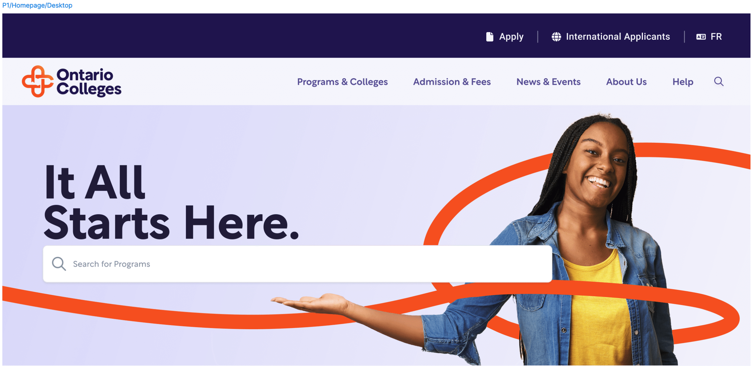
ontariocolleges.ca
Users:
Prospective students, college partners, and internal teams
Scale:
Ontario’s 24 public colleges
Role:
Product Design, UX Design, Information Architecture, Accessibility, Design Systems
My Contributions
- Information Architecture
- Navigation Design
- User Flows
- Design Systems
- Accessibility Advocacy
- Wireframing & Prototyping
- Stakeholder Collaboration
Team:
Product Manager • Developers • Designers • Content Specialists
Project Overview
Objective: Help students find the right information without overwhelming them.
Annual Visitors
Annual Applicants
Ontario Public Colleges
of Programs, Resources, & Pathways
Created a connected discovery ecosystem that supported users from initial exploration to informed decision-making.
Discovery Ecosystem
“The System”

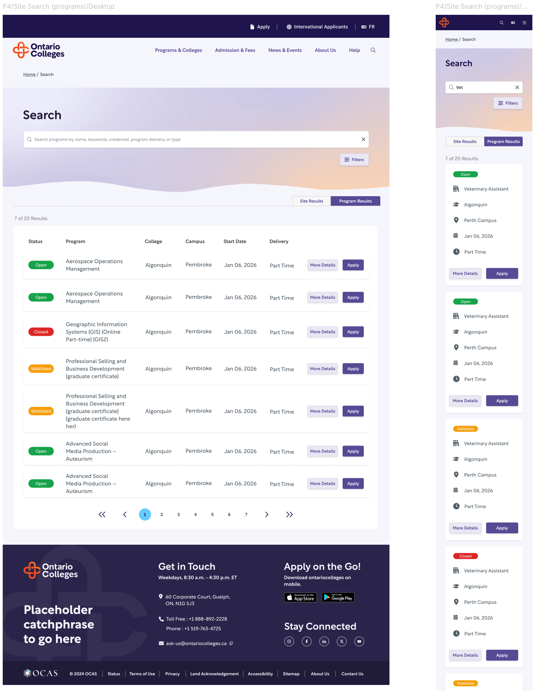
Search-Driven Discovery
- Ontario Colleges serves as the primary discovery platform for Ontario’s public college system.
- Students arrive with varying goals, from researching specific programs to broadly exploring educational opportunities.
Personas

Direct Learner
Knows exactly what they want.
Needs the fastest path from discovery to application with as little friction as possible.
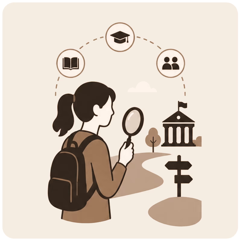
Explorer
Comparing possibilities.
Still evaluating options and gathering information before committing.
Mature Learner
Returning to education.
Looking to advance or change careers after time away from formal learning.
Site Navigation
Transformed a growing content ecosystem into a clear, intuitive experience that users could navigate with confidence.
Challenge
- Growing content increased navigation complexity.
- Users needed to find information without feeling overwhelmed.
- Desktop and mobile required a consistent discovery experience.
Solution
- Designed a scalable navigation system capable of supporting a growing content ecosystem.
- Structured information around user intent rather than organizational hierarchy.
- Connected search, menus, and exploration tools into a unified discovery experience.
Outcome
- Usability testing showed users found the navigation intuitive and easy to navigate.
- Participants confidently explored navigation without hesitation or assistance.
- The navigation extended the site’s visual identity while maintaining usability.
- The framework successfully balanced a growing information architecture with a simple, approachable experience.
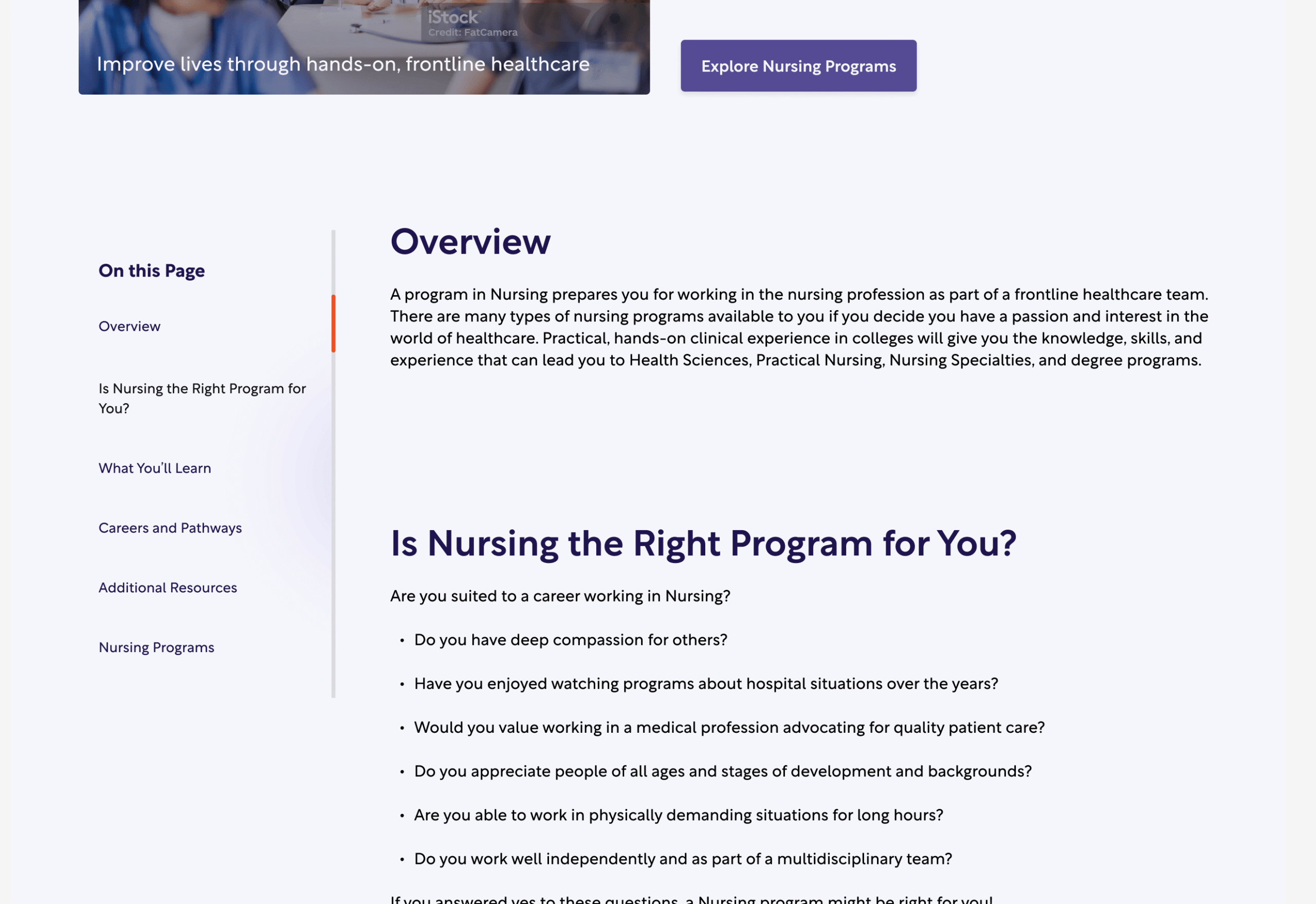
Navigating Long-Form Content
Improved content discovery by making complex information easier to navigate.
Challenge
- Long pages risk users not seeing content because they haven’t travelled the length of the content.
Solution
- Create a navigation feature that explores the content down the entire page before the user has to scroll.
- Provide quicklinks to anchors further in the content.
- show the user where in the content they are.
Outcome
- Users could quickly understand what each page contained before committing to reading it.
- Supporting resources received significantly higher engagement than in previous versions, indicating improved content discoverability.
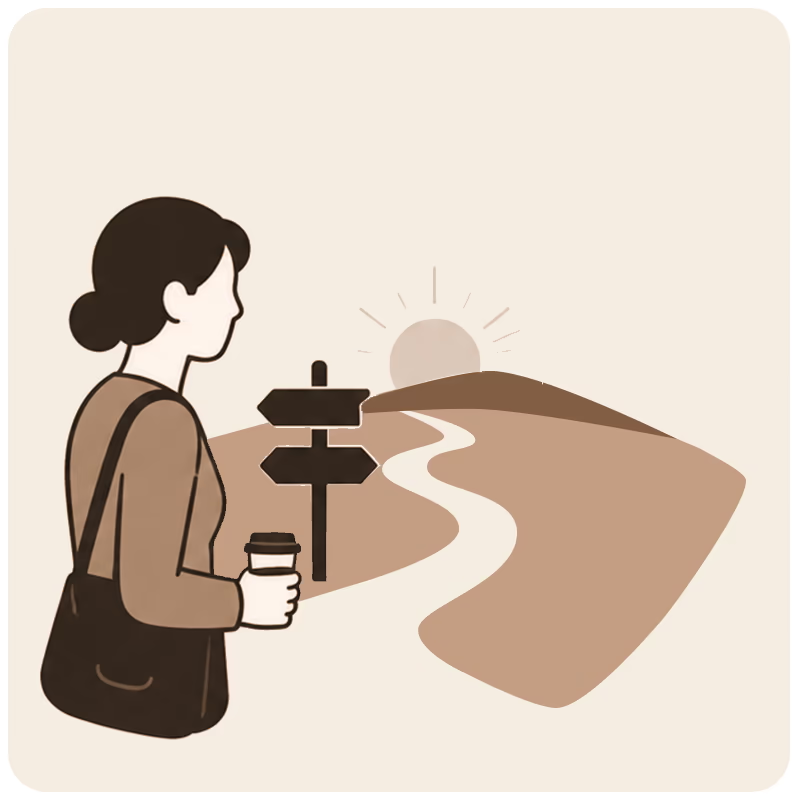
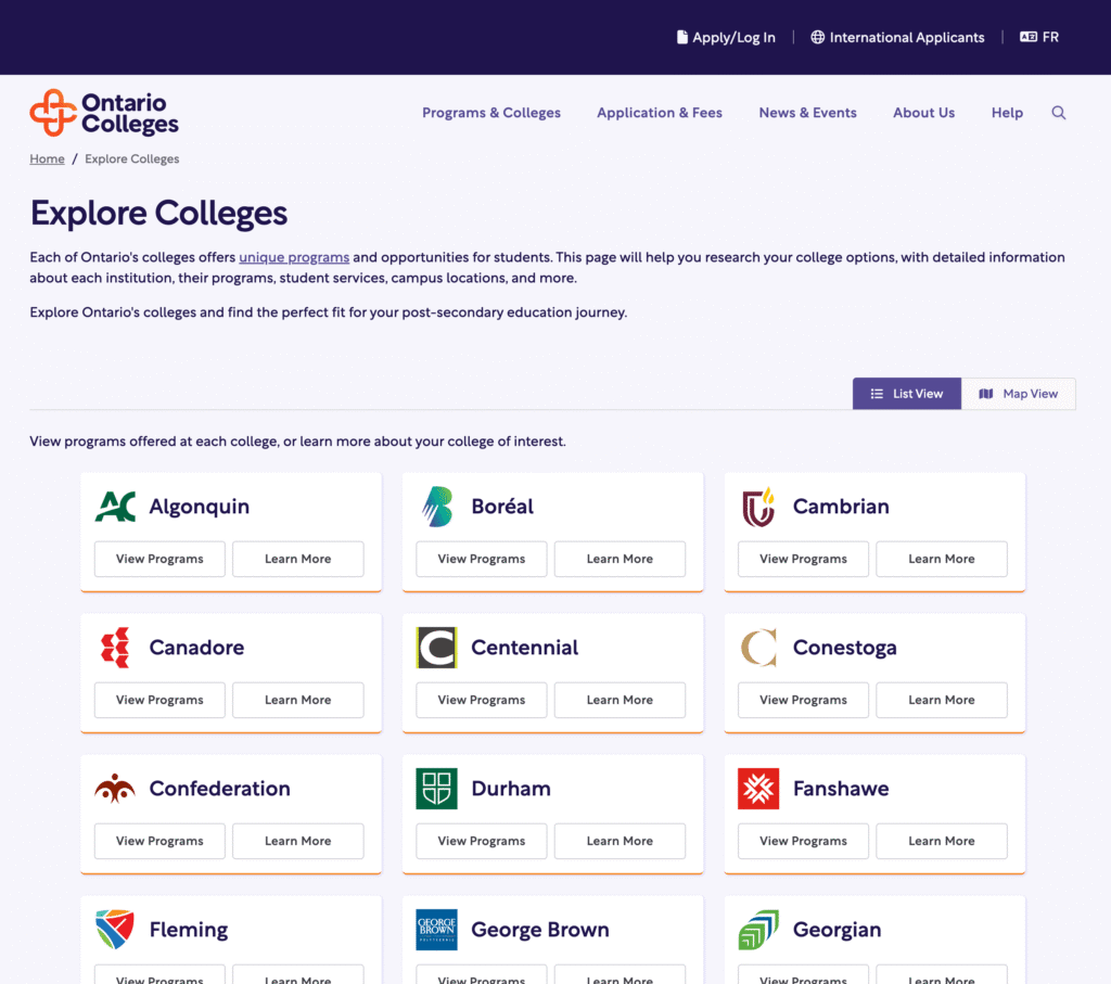
Exploration Beyond Search
Enabled users to discover educational opportunities through multiple exploration and discovery pathways.
Challenge
- Search alone didn’t support every student’s journey.
- Many prospective students were still exploring options rather than searching for a specific program.
- Users needed multiple ways to discover colleges and programs.
Solution
- Expanded discovery beyond search with browse and exploration experiences.
- Introduced pathways based on location, college, credentials, and interests.
- Supported both goal-oriented and exploratory decision-making.
Outcome
- Users reported improved discoverability.
- Participants completed testing without facilitator assistance.
- Colleges responded positively to the revised experience.


Project Outcomes
User Impact
- Participants completed usability tasks without facilitator assistance.
- Users reported improved discoverability and intuitive navigation.
- Supporting resources received significantly higher engagement.
Platform Impact
- Created a scalable discovery ecosystem for 24 colleges.
- Unified search, navigation, and exploration into one coherent experience.
- Established consistent patterns across desktop and mobile.
Design Impact
- Introduced reusable navigation and information architecture patterns.
- Extended the platform’s design system with scalable discovery components