Project Overview
Design a scalable visual language that creates a consistent, recognizable experience across a bilingual platform while strengthening the Ontario Colleges brand.
Custom Image Elements
Pathy Characters
Custom Icons
Challenge
- The existing brand language lacked a consistent presence throughout the digital experience.
- Visual elements needed to communicate clearly across a bilingual platform.
- The growing product required reusable patterns that could scale over time.
Solution
- Expanded the learner pathway into a scalable visual language system.
- Applied the visual language to iconography, instructional content, and wayfinding.
- Established reusable patterns that reinforced both usability and brand recognition.
Outcome
- Created a more cohesive and recognizable product experience.
- Improved user orientation through consistent visual cues.
- Delivered a flexible visual system that scaled with the evolving platform.
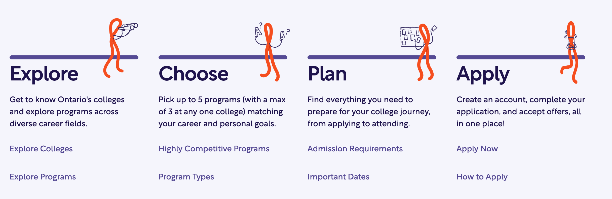
Visual Pathways as a language
Transformed a simple brand motif into a visual language system that guided users throughout the application journey.

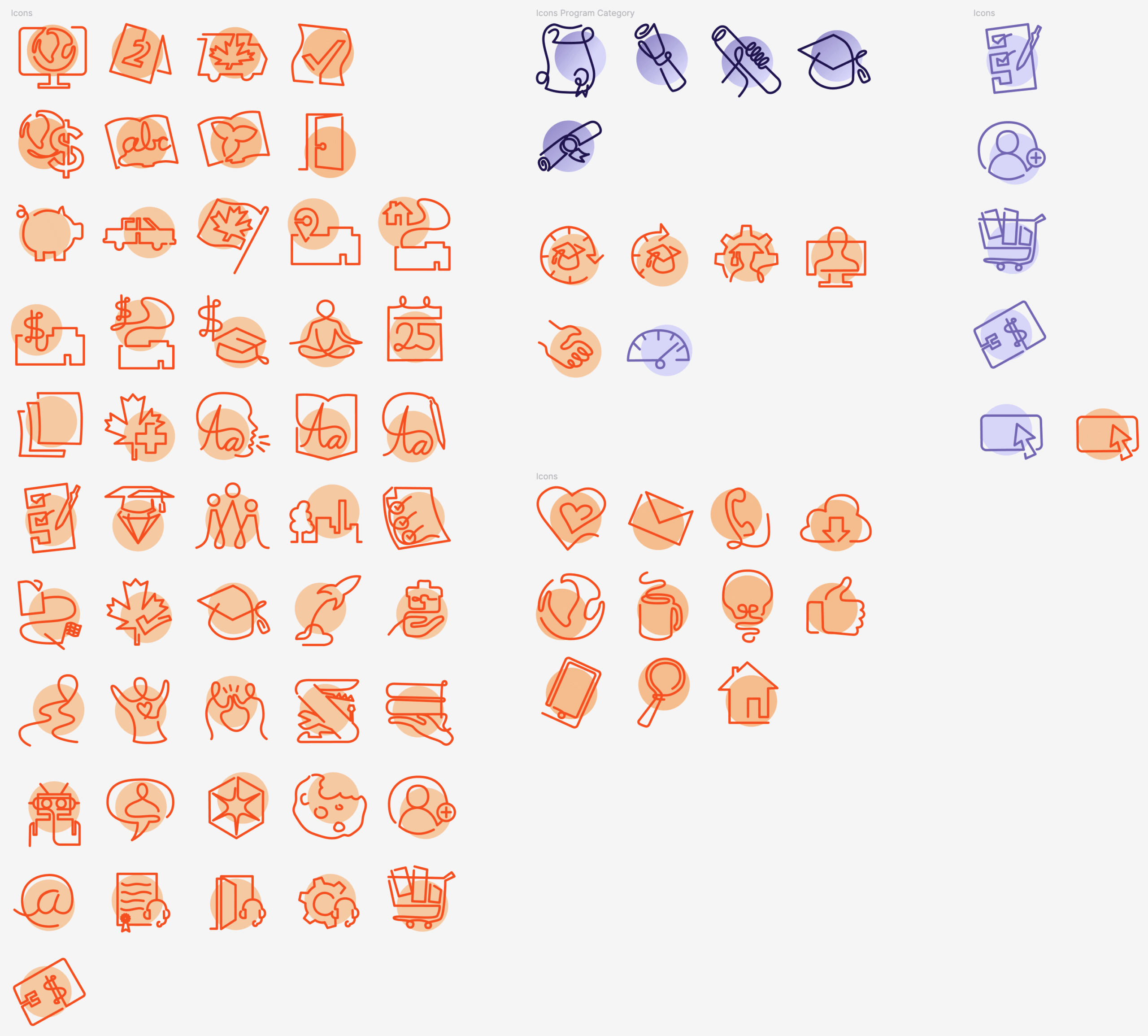
Building an Iconography System
Challenge
- Interface elements lacked a cohesive visual language.
- New features required scalable, reusable visual patterns.
- Brand recognition needed to extend beyond logos and colour.
Solution
- Expanded the learner pathway into a reusable iconography system.
- Applied the continuous-line motif across navigation, discovery, and audience-specific experiences.
- Created a flexible visual system that could grow alongside the platform.
Outcome
- Reinforced brand recognition throughout the user experience.
- Improved visual consistency across navigation and content discovery.
- Enabled new features and content to be introduced without sacrificing familiarity or cohesion.
Transformed a core brand motif into a scalable iconography system that improved recognition and orientation.
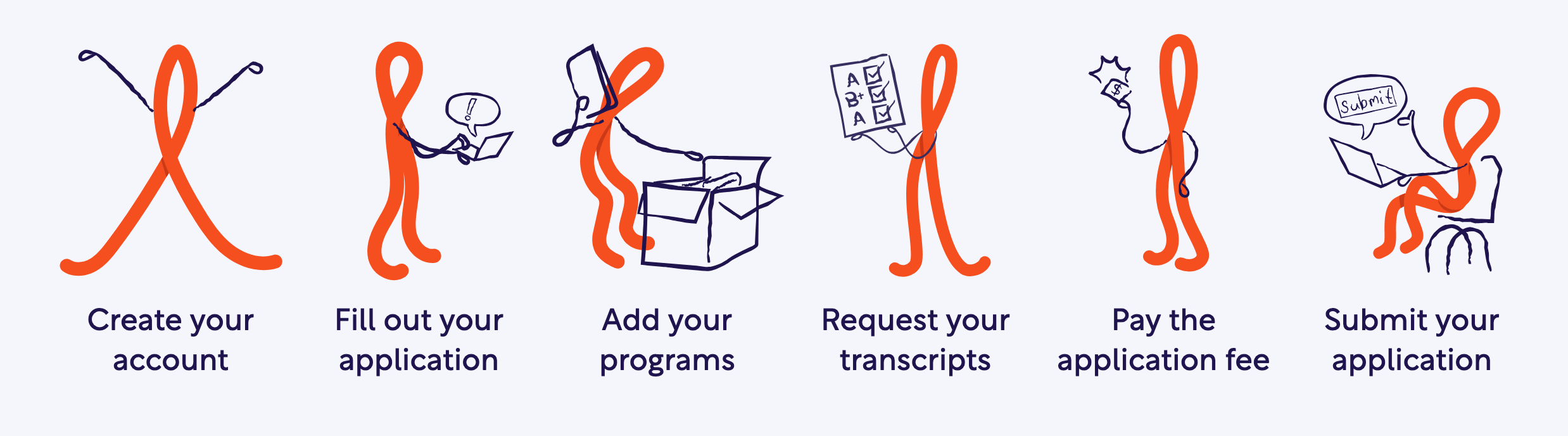
Bringing the Pathway to Life
Challenge
- Complex processes could feel impersonal and intimidating.
- The platform needed a more approachable way to guide users.
- Brand recognition needed to extend beyond interface elements.
Solution
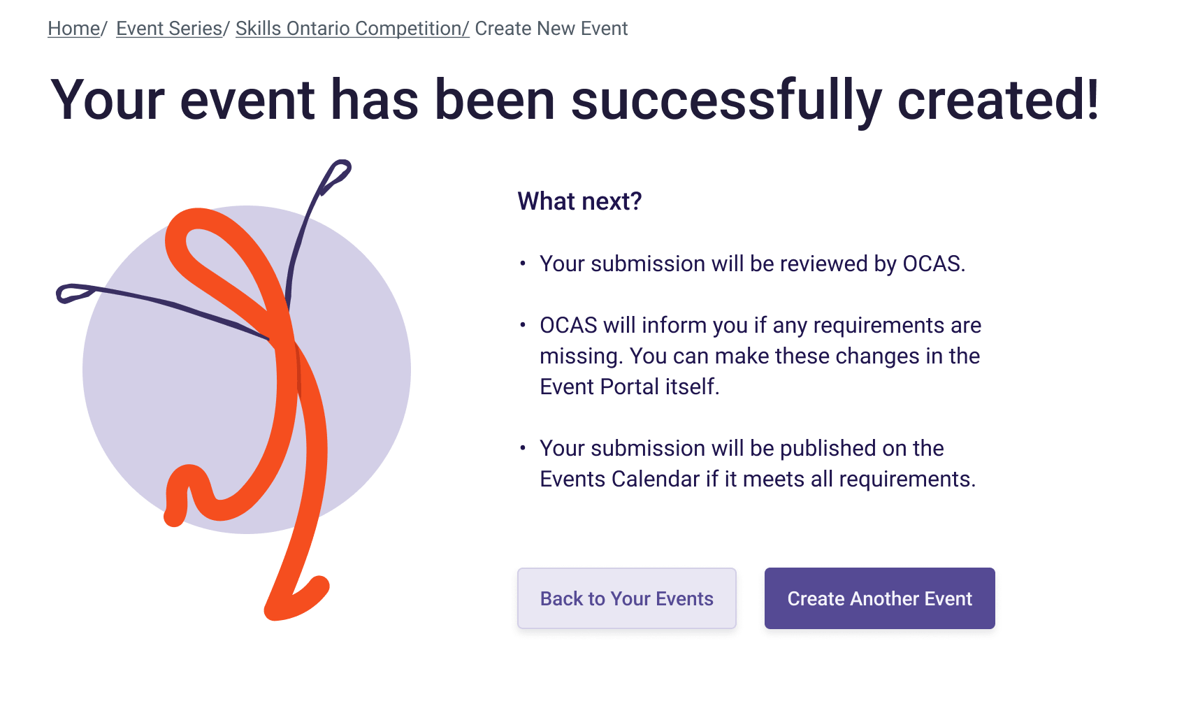
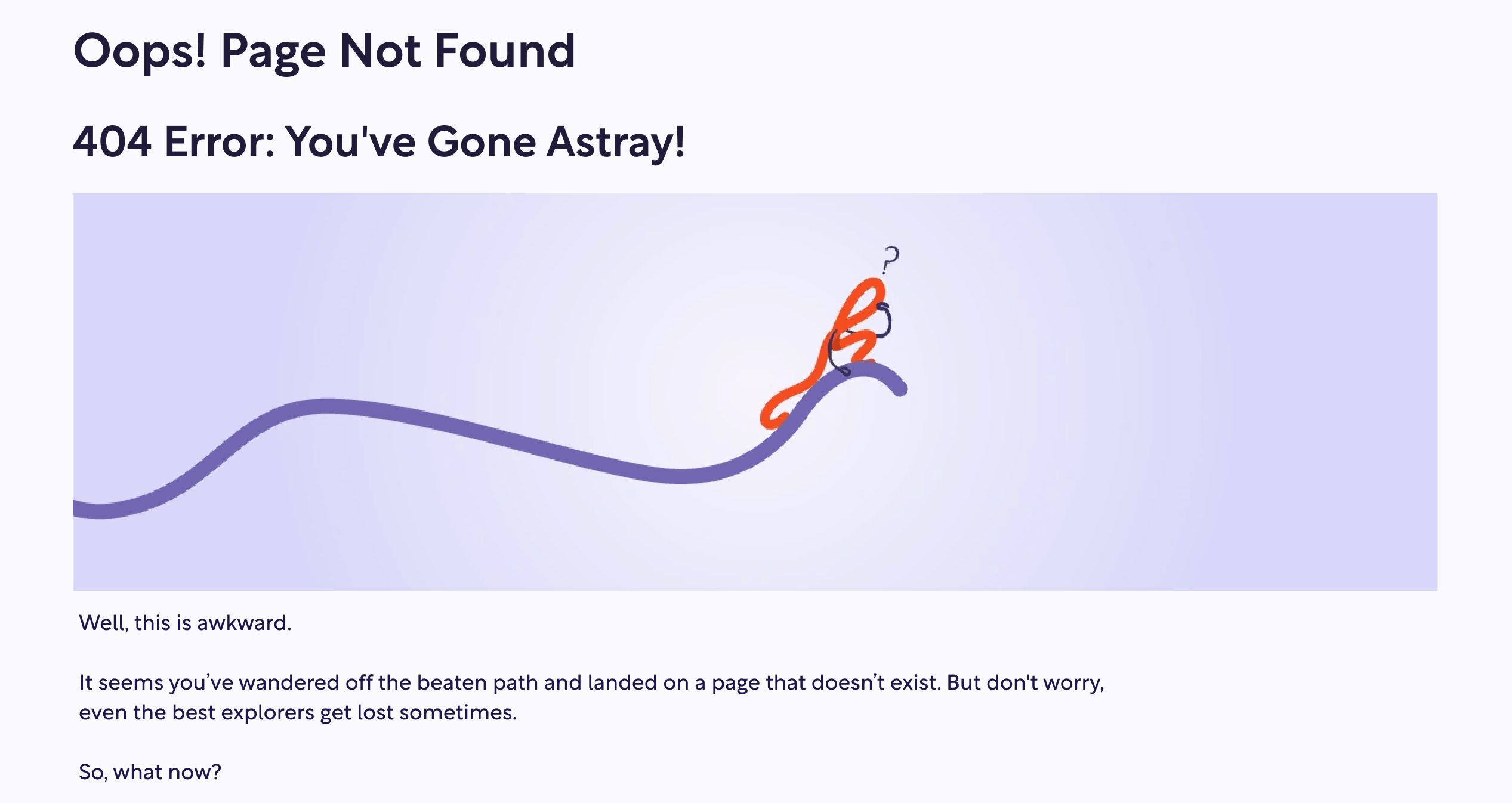
- Evolved the learner pathway into a recurring guide character, Pathy.
- Integrated Pathy throughout instructional content, guidance, success states, and error messaging.
- Used consistent visual storytelling to reinforce the learner journey across the platform.
Outcome
- Made complex interactions feel more approachable and engaging.
- Strengthened brand recognition through a consistent visual presence.
- Created a memorable guide that supported users throughout their application journey.
Transformed a visual motif into a recognizable character that guided, informed, and supported users throughout their journey.
Key Takeaways
Building Ontario Colleges reinforced my belief that the best user experiences aren’t created by individual features, but by connected systems that help people move confidently from uncertainty to action.