 Fetching Creativity
Evolving the Instacart.ca
Shopping Experience
Platform
Instacart.ca (concept)
Users:
Online grocery shoppers
Role:
Product Designer
My Contributions
- Information Architecture
- Navigation Design
- User Flows
- Visual Design
- Design Systems
- Accessibility
Project Overview
Objective: Explore how Instacart’s visual identity could evolve into a cohesive design system that improves usability, brand recognition, and accessibility across the product experience.
Discovery Interviews
To validate my design assumptions, I conducted interviews with five participants representing a range of ages, backgrounds, and shopping habits. Rather than interviewing designers, I intentionally selected everyday shoppers to better understand how typical users interpreted the existing interface. I documented recurring observations and used those findings to guide the redesign.
Key Findings
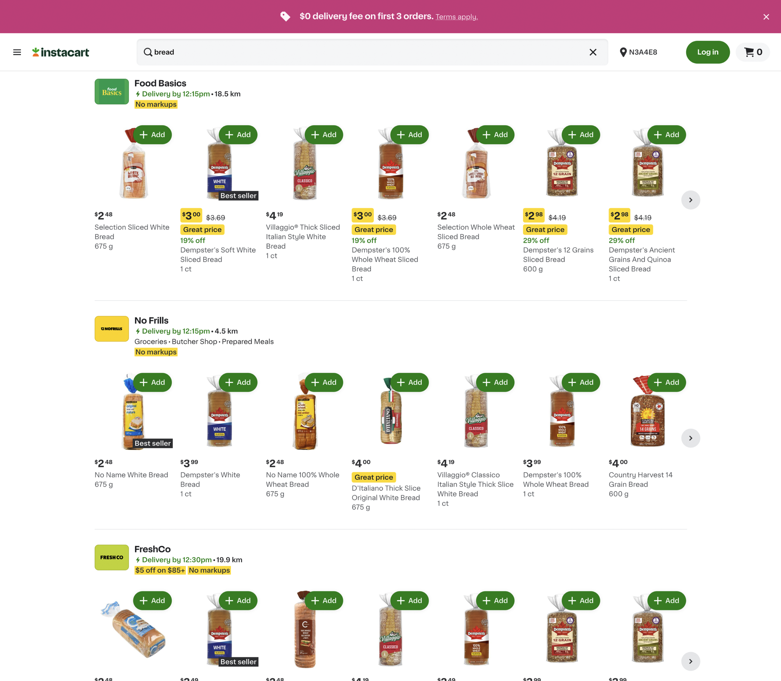
- Participants consistently described the page as visually cluttered and difficult to scan.
- Status messages were frequently mistaken for promotional content, creating confusion around visual hierarchy.
- Participants struggled to distinguish where one store’s product listings ended and another began, as store labels were only visible after entering a product row.
Challenge
- Visual hierarchy competed with merchandising and promotional content.
- Brand expression was largely limited to the logo and colour palette.
- Navigation and product discovery lacked consistent visual cues.
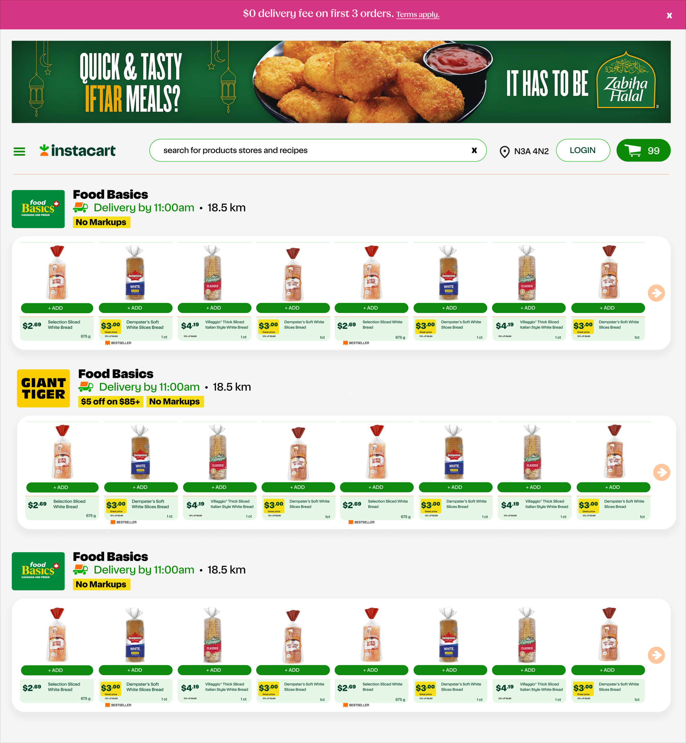
Solution
- Strengthened visual hierarchy to improve scanability and information architecture.
- Expanded Instacart’s brand language into reusable interface elements and iconography.
- Refined navigation and supporting UI patterns to create a more cohesive shopping experience.
Outcome
- Reduced visual noise while improving content focus.
- Increased brand consistency across key customer touchpoints.
- Demonstrated how extending an existing design system can improve usability without changing core workflows.
Expand the brand into a scalable design language
Instacart’s carrot is one of the product’s strongest visual assets, but its distinctive style exists almost exclusively within the logo. I saw an opportunity to extend that visual language throughout the interface, transforming a single brand mark into a cohesive icon system.
Building on the geometric forms and colour palette of the carrot, I explored concepts such as a delivery vehicle, navigation arrow, and favourite icon. These illustrations reinforce brand recognition while creating a more consistent and approachable product experience.
The system is intentionally scalable. Additional icons for shopping carts, home navigation, search, orders, and notifications could all be developed using the same design principles, allowing the visual language to grow alongside the product.

Project Outcomes
Design Exploration
-
Demonstrated how Instacart’s existing brand language could evolve into a cohesive, scalable interface system.
-
Expanded the visual identity into reusable interface patterns and supporting iconography.
-
Explored how existing brand assets could strengthen recognition without introducing new visual conventions.
User Experience
-
Improved information hierarchy by separating primary actions, trust indicators, and supporting content.
-
Reduced visual competition while strengthening retailer branding and product discoverability.
-
Created clearer visual pathways through browsing, discovery, and purchasing.
System Thinking
-
Developed reusable interface patterns that could scale across future shopping experiences.
-
Illustrated how visual design systems can improve usability without redesigning core workflows.
-
Produced a complete end-to-end product design case study documenting research, discovery, ideation, and validation.